

| Title: Dingfont Tut | |
| Babs5251 > Animation Tuts > PSP Tuts | Go to subcategory: |
| Author | Content |
|
JigsawQueen
|
|
|
Date Posted:07/08/2017 14:25 PMCopy HTML I won't always have fun things to challenge your minds when it comes to fonts, and if there is anything that someone would like to contribute to our higher learning, please step forward and I will set you up for you to challenge the other members in the on going font challenge hosted here every week. Today I want to use a DINGFONT, which is a .ttf font that has some type of noticeable ornamentation out of the normal but still uses the letters within the ornamentation. Dingfonts are not to be confused with DINGBATS, which uses a certain letter to create a certain pattern. So Dingfonts have the letter showing and the Dingbat uses the keystroke of letters to create something other than a letter. This week's font is called Scrap Roller Coaster, and yes when typing with the dingfont you will see letters, but we aren't going to use the keystroke for letters, instead we are going to use the dash keystroke. You can use the small dash to make scallop type images for your tag, if you hit the shift key (using the underline and it will give you a concave scallop.) A closer look at what the Scrap Roller Coaster font using the dash keystroke 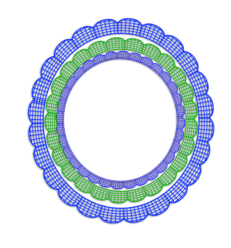 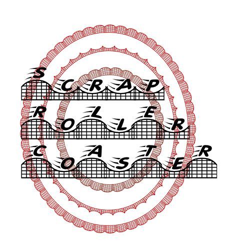 Now don't think that you have to use Dingfonts in order to get some effects that as a rule would be time consuming, such as making scalloped edging by using the letter O in Ariel or something. So for those of you that know how to add text to a curve scoot right on down and read the challenge and then you are ready to rock and roll. If you are new to adding text on a curve, continue to read on down to where I have a link to a wonderful tut by Bearlie and me that will tell you how to go about getting the hang of text on a curve. Okay so here we go... FONT NAME FOR A ROUND FRAME: Scrap Roller Coaster download font here: http://www.adrive.com/public/X45bWZ/Scrap Roller Coaster.ttf You can find a tutorial by Bearlie on the subject of text on a curve here: http://bamacreations.yuku.com/topic/6610/BOBBIE-ALLEN-TUTORIAL-CIRCLE-MY-HEART There is a tutorial by me on text on a curve you can find here: http://bamacreations.yuku.com/topic/148/Putting-Text-On-A-CurveMarilyn-Allen-Tuts Instructions for round frame using the font Scrap Roller Coaster: 1. Open a new 600x600 canvas we will crop it later, with white background (so we can see better, we will eliminate it later). 2. Go over to your tool bar and click on preset shapes . 3. In your preset shape menu bar click the drop down and choose circle (some versions it's called an elipse). 4. Go to your materials palette and choose the color for your inner circle. You can add a darker color as your stroke if you would like or you can null the stroke color, your choice. 5. Draw a circle to the size you want it, mine is approx. 475x475, and convert it to raster so you can do things like bevel it or add noise to it, etc. etc. 6. Once you have your circle the way you want it, go back to your preset shape tool, and choose your circle once more. 7. Before you draw this circle you need to check mark the "Retain Style" box next to your drop down menu. You will notice when you draw your circle you get nothing but a thin black outer line for your circle, no color and no center. 8. Click and drag it down and over your inner circle, once you release your cursor, it will have adjustment nodes, so you can adjust it to fit the inner circle EXACTLY, you want it to be at the very edge of the inner circle, and EVEN all around. 9. After you have adjusted your line, MAKING SURE YOU LEAVE IT IN VECTOR MODE, go to your Materials palette and choose the color you want your frame design that will go around the entire radius of your inner circle. 10. Open your font window and choose the dingbat Scrap Roller Coaster (or any font of your choice). Hover your cursor over the RETAINING LINE until you see a T or an A, (depending on what version you are using), and under the T or A you will see a curved line called a rocker line. Once you have located your font with a rocker arm under it, click on that spot and start adding the letter O over and over until it goes clear round the inner circle, 11. Now go to your layer palette and look for a small plus sign beside your vector layer, click on it and you will see sublayers, go to the one that says PATH and hide it, and then convert to raster, this makes your RETAINING LINE disappear. 12. you can stop there if you want or you can add additional decorations around it using the same method. (Like I did with mine) TIPS AND POINTERS: A. ALWAYS USE A BACKGROUND OF SOME SORT THAT WILL LET YOUR COLOR CHOICE FOR THE CIRCLE SHOW UP, YOU CAN DELETE IT ONCE YOU ARE READY TO MERGE YOUR TAG. B. WHEN CLICKING ON YOUR CIRCLE WITH THE ROCKING T OR A, REMEMBER THAT YOUR WORDS WILL START WHERE YOU CLICKED AND RUN TO THE RIGHT OR CLOCK WISE, SO IF YOU CLICK TOO FAR TO THE RIGHT YOU CANNOT BACKSPACE LEFT, SO MAKE SURE THAT YOU'RE FURTHER TO THE LEFT THAN YOU WANT YOUR DESIGN TO START, AND THEN YOU CAN SPACE BAR IT INTO PLACE. C. YOUR DESIGN WILL ALWAYS BE ON THE OUTER SIDE OF THE CIRCLE AND RUN LEFT TO RIGHT. D. IF YOU WANT YOUR TEXT OR DESIGN TO BE ON THE BOTTOM OF THE CIRCLE, YOUR TEXT OR DESIGN WILL BE ON THE INSIDE OF YOUR CIRCLE. THERE IS A SUPER EASY WAY TO GET YOUR TEXT OR DESIGN TO RUN UNDER THE TAG, YOU DRAW IT OUT AS USUAL, AND THEN WHEN YOU HAVE IT THE SIZE YOU WANT, YOU MERELY "FLIP " IT OVER BY USING YOUR FLIP BUTTON, AND THEN WHEN YOU CLICK TO MAKE THE ROCKING T OR A, THE TEXT OR DESIGN WILL RUN CONCAVE FROM LEFT TO RIGHT. E. AN EASY WAY TO MAKE A SCALLOPED EDGE IS TO DRAW YOUR RETAINING CIRCLE ON THE INSIDE OF THE INNER CIRCLE JUST ENOUGH TO CUT YOUR DESIGN IN HALF, TYPE THE LETTER O ALL AROUND THE INNER CIRCLE, CONVERT THEM TO RASTER AND THEN DRAG THE "O'S" BELOW THE INNER CIRCLE AND YOU WILL SEE THE HALF OF THE CIRCLE THAT WILL CAUSE IT TO LOOK SCALLOPED BECAUSE YOU WILL ONLY SEE HALF THE CIRCLE. F. DO NOT FORGET TO HIDE YOUR RETAINING LINE BEFORE CONVERTING VECTOR TO RASTER. G. IF YOUR DESIGN HAS A "GAP" BETWEEN THE BEGINNING AND END, HIGHLIGHT YOUR DESIGN AND THEN GO TO THE "KERNING" BUTTON AND START MOVING THE NUMBERS HIGHER, UNTIL YOU HAVE THE ONE THAT CLOSES THE GAP. THE NORMAL INCREMENTS OF YOUR KERNING IS 25, BUT YOU NEED TO TYPE IN THE AMOUNT YOU WANT, I USUALLY START WITH 5 AND GO UP OR DOWN ACCORDINGLY. JUST REMEMBER THAT YOUR DESIGN HAS TO BE HIGHLIGHTED BEFORE YOU CAN CHANGE THE KERNING. ( THE KERNING IS THE TOOL THAT SPACES THE LETTER'S SPACES BETWEEN EACH OTHER) AND ONLY A VECTOR CAN BE HIGHLIGHTED FOR MAKING CHANGES. H. IF YOU HAVE AN OVERLAP OF YOUR DESIGN, YOU WILL WANT TO "MINUS" YOUR KERNING NUMBERS, DOING SO WILL CAUSE THE SPACE BETWEEN LETTERS TO GET SMALLER. I HOPE YOU ALL ENJOY THIS CHALLENGE...BE SURE TO COME BACK AND SHOW US WHAT YOU HAVE MADE... Here is a flower I made, using the Scrap Roller Coaster:  I am going to leave a couple of other snags I made using different Dingbats and Dingfonts below; This is a scalloped one, I used the O in the Ariel Rounded 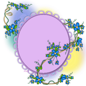 Here is one I made using a dingbat that was flowers:  I used a dingbat called Eazy Borders for this one....  a plain version of the scalloped trick 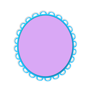 |


Copyright © 2000- Aimoo Free Forum All rights reserved.
Skin by SandhillsDebby © Trina Clark digiscrapkits.com
